A brand new shiny website
Mailboxfiler started with a humble logo and a straightforward website. The first version of the website was pretty basic without our designer. Though we were happy with the initial version of the website, we felt something was lacking. We always wanted a theme and colours that go well with Mailboxfiler as a product. To get to this stage, we went through a lot of designs and different agencies. As you might know from our tweets, we are a tiny team ( just 2 people )—a developer to take care of the application's back-end and the marketing person working part-time. A developer can make a web application functioning and stable. In fact, we are proud of what we have achieved so far with literally one single developer. To make things polished, the designer takes a huge role.
We didn't have enough funding to launch a product with a shiny new website from the very beginning of the product development. Our first move was to hire a designer from Fiverr. We did buy few designs through Fiverr and were not fully satisfied. Hiring designers from Fiverr is hard, and adding more designer without proper communication is even worse. During that time, a logo was designed by one designer and the website design was given to a completely different team. As one can expect, the colours, theme and especially the thinking didn't match well.
After a lot of struggle, we found a great designer. We had some idea about the logo. As attachments are the main theme of our product, we were thinking about portraying attachments in the logo. Human communication has a very long history. And, Pigeons play a wonderful role by transmitting the information. It was tiring to match this piece together. Our designer did a fantastic job with the new logo.


We were thrilled with the logo and couldn't think of anything else. The moment the logo was finalized, theme colours were our next priority. The designer believed the website design and the application should seamlessly follow the same theme colours, making sense. It was great to see the design and colours merge throughout Mailboxfiler. It was really a time-consuming process for a team of this size. But, in the end, we are completely flattered by design.
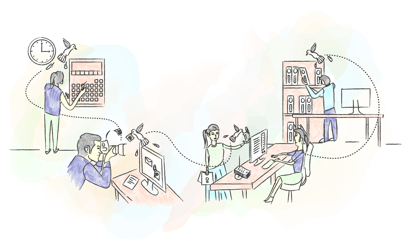
Every single picture conveys our product in a subtle way. The background colour patches not just highlights the images but also emphasizes their importance. We spent tremendous hours finalizing the first image of the website. We pushed our limits hard to convey the idea behind Mailboxfiler.

It's not always convenient and easy to showcase the product's features in the main banner image. In this case, we are so convinced that the core part of the product, like folder structures, organizing, and categorizing, is highlighted clearly. The same goes with the process behind How it works page. The images in each step are illustrated precisely to the point.
We are thrilled and are looking forward to your feedback. Please let us know what do you think. We are on social networks as well.
Follow us on Twitter @mailboxfiler. Reddit - Subreddit Mailboxfiler